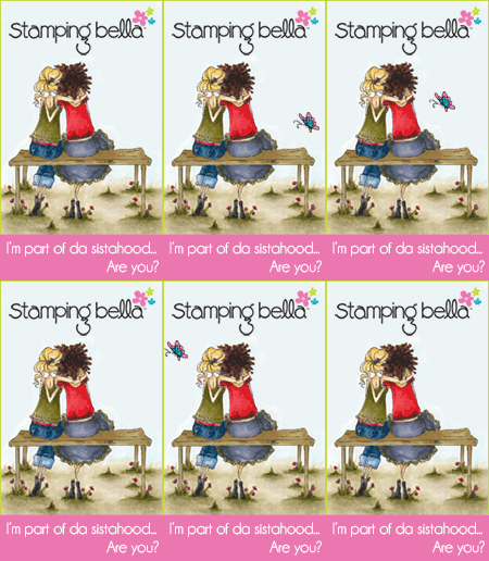
Check out my card from before on the left, aka. my first draft (pervious post) and my second/final draft on the right. Which one do you think is better?
Not only do I think the second/final draft is better, I did a better job with my lighting and the image looks better. I guess the lesson here is that if at first you don't succeed, try again!!! :)
Thanks for stopping by!


2 comments:
I'm a sucker for anything with flowers, so I like the 2nd one, too. Great job - as usual!
I liked the first one alot (great colors!), but like it even more with the flowers -so pretty!
Post a Comment